|
|
Post by nzp on Sept 13, 2011 17:34:21 GMT -6
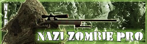
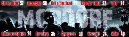
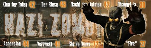
I am attempting to create images in Photoshop CS5. I haven't had much experience with it at all and have basically taught myself so far although I am taking a Desktop Publishing class that touches on PS, InDesign, and Bridge (as of yet we are not far along, so haven't learned anything new). I want some feedback for some images I made, but I want people to remember that I am a beginner but also give some constructive criticism. As you will see, the images improve as I experiment more from bottom to top...I've only begun doing this three days ago. These are signature images for my site; if you played or are familiar with this game mode, you would understand the meaning of the words and numbers in these images: As you can see, I improved from bottom to top, top being the newest one I've made. Thanks for the help and feedback. |
|
Bob Ness
Top contributor
 zomg, it's called Bob!
Posts: 324
|
Post by Bob Ness on Sept 13, 2011 19:08:52 GMT -6
I just wanna say that those are amazing! My favorite is probably the first one, but all of them are great. I especially love the borders added on in the first three.  |
|
|
|
Post by nzp on Sept 13, 2011 19:57:00 GMT -6
I just wanna say that those are amazing! My favorite is probably the first one, but all of them are great. I especially love the borders added on in the first three. Aw, you're so kind.  Also, I added one to the top. |
|
Jen
Creative Chick  Admin
Admin
Posts: 8,309 
|
Post by Jen on Sept 14, 2011 13:25:27 GMT -6
Wow. Those are awesome NZP! Very cool looking designs.  I have to say my favorite is the one you're currently using as your signature.  The only suggestion I would make is with the second one. I like the reflection you added to your name. I think it really adds a lot. But see how the e and s's reflections are overlapping your name? I would cut the e and s out and then move them up a bit so they're level with the other letters. Then when you make the reflection it won't overlap. |
|
|
|
Post by nzp on Sept 14, 2011 16:51:29 GMT -6
Wow. Those are awesome NZP! Very cool looking designs. I have to say my favorite is the one you're currently using as your signature. The only suggestion I would make is with the second one. I like the reflection you added to your name. I think it really adds a lot. But see how the e and s's reflections are overlapping your name? I would cut the e and s out and then move them up a bit so they're level with the other letters. Then when you make the reflection it won't overlap. Thanks! ;D And yea, I realized that font would do that when reflective, I'll fix it when I have time. EDIT: Also added a very plain green one. |
|
Jen
Creative Chick
Admin
Posts: 8,309
|
Post by Jen on Sept 14, 2011 23:40:02 GMT -6
I really like the fonts you used for your signatures.
|
|


 I have to say my favorite is the one you're currently using as your signature.

